

LATITUDE
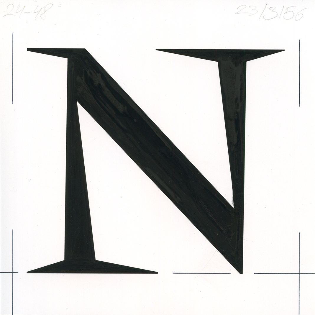
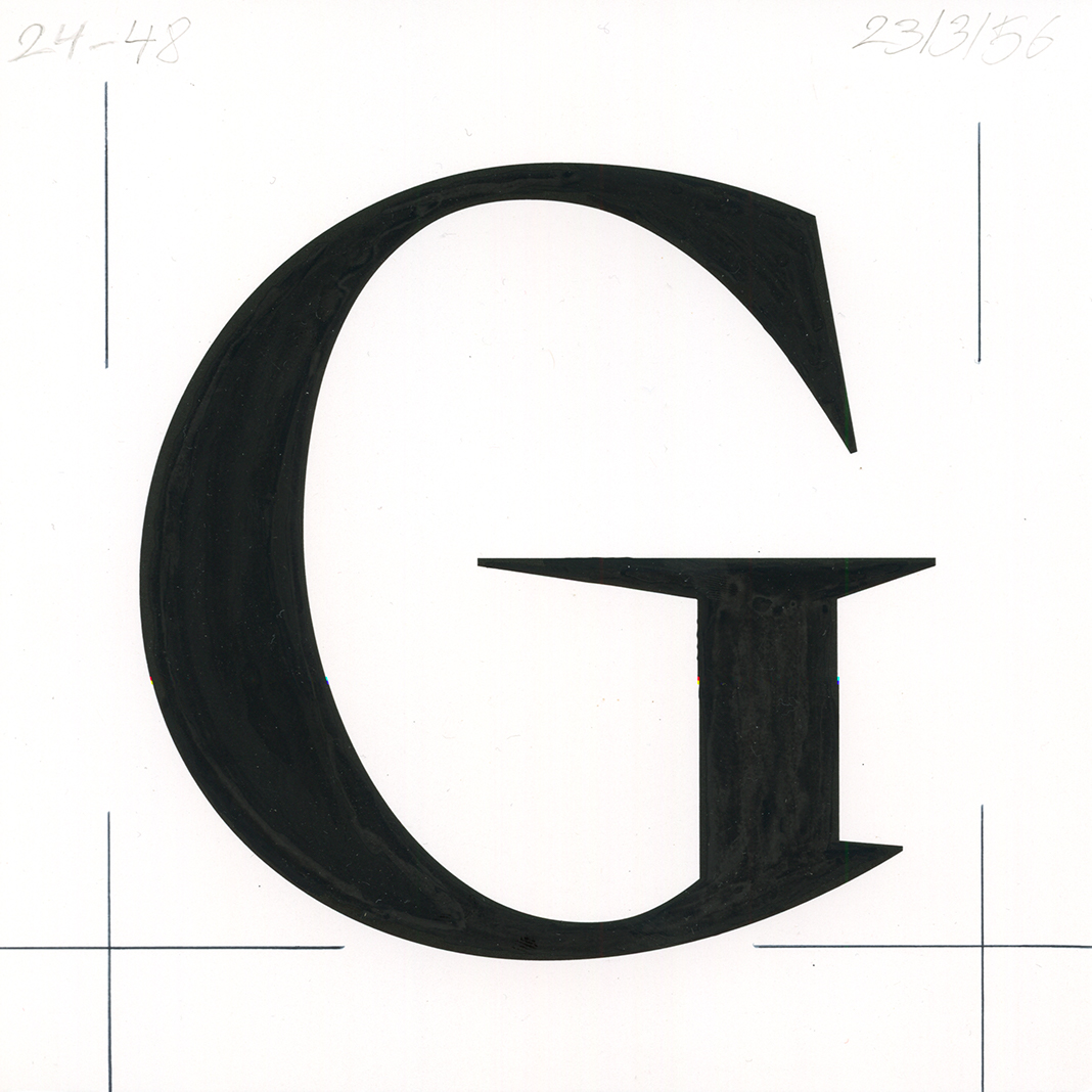
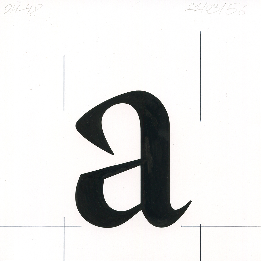
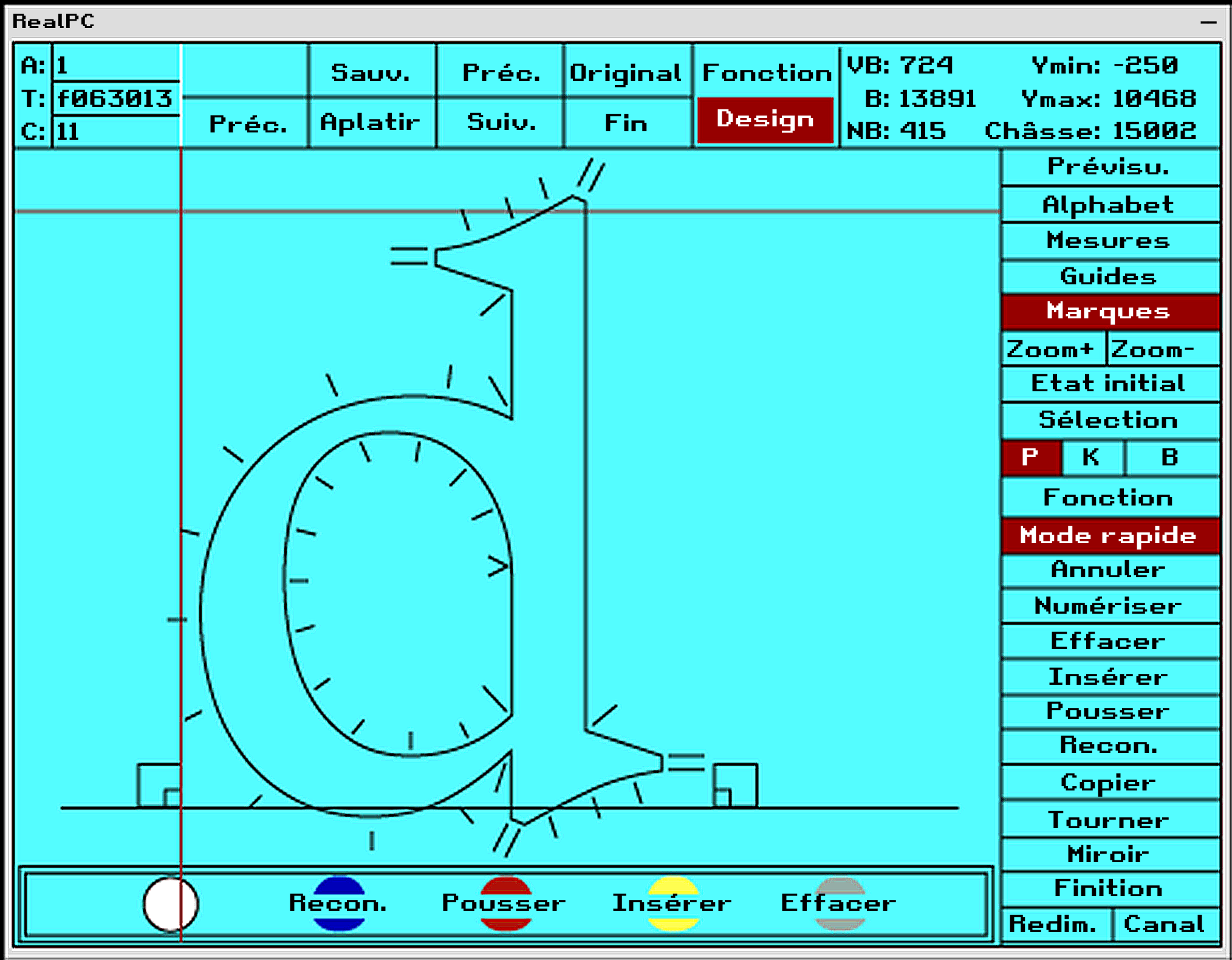
In 1955, following the commercial success of the Vendôme typeface distributed by the Olive type foundry, the Fonderie Typographique Française decided to produce a typeface with similar traits. As the creative director of the foundry Enric Crous-Vidal rejected the idea, Ange Degheest was entrusted with the project, resulting in the Latitude typeface. At that point Degheest had been working for the foundry as an assistant for five years, and had helped design several typefaces such as Horizon, Paris and Flash. For the overall structure of the typeface she drew inspiration from a Gros Parangon cut by Granjon in the 16th century. In order to give it a Vendôme-like feel, she sharpened the instrokes, outstrokes and serifs and tightened the curves, resulting in crisper shapes. Degheest also designed a display version of Latitude, named Équateur which is more contrasted and even sharper than Latitude. When the type family was released commercially, it was simply attributed to FTF without mentioning their author anywhere in the marketing material. After the Fundicion Tipografica Neufville acquired the rights to the Fonderie Typographique Française’s catalogue of typefaces, it started digitizing Latitude and Équateur with the Ikarus software in 1980.
Download here →
