We design libre / open source fonts. Learn more and contribute to the adventure of Velvetyne by reading our “about” page.
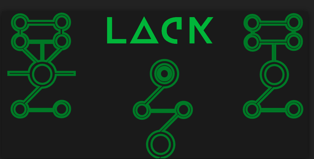
The short but real VTF Lack story
Disclaimer:
As of our update of November 2023, Lack has been retired from Velvetyne. You can still download it here. To know more about the reasons behing this retirement and the list of the other retired fonts, please read the dedicated article we wrote on the topic.
Lack typeface project began in 2012 when Adrien was commissioned by Rio Nebulane, an electronic music band, to create their first album cover.
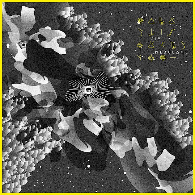
The fisrt thing achieved for this work was a visual language etablishment inspired by hieroglyph’s system. Then, a certain legibility became to be necessary to read at least the band name. So Adrien started to search an option to keep this mysterious visual flavor about hieroglyphs into a custom font. This first fruits are really important in the story of Lack, because the research of the limits of ligibility inside the letterform comes from here.
Logotype for test
The research leads design of some letters to compose the band name Rio Nebulane. After many tests proceed to find the good proportions and legibility, the logotype was ready.

Back in time, the first Open Type features
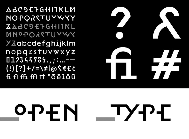
The previous tests offered a large choice of letter forms and Adrien wanted to keep them as much as possible. He discovered the Open Type font format. It was a big joy to play and work with this features for the first time. A stylistics set was added to the Lack.
Where put and publish this strange font?
Adrien, really proud of this typeface searched a way to promote it. He found the perfect solution with Velvetyne Type Foundry, the really kind guys fascinated by all typographic fields, indeed the most strange.
So, Lack joined the VTF font catalogue in 2013, and it was the first free-font designed by Adrien Midzic.
It could live her own life and been used by graphics designer to serve their graphic design works.
3 years later, a trip and a new friend
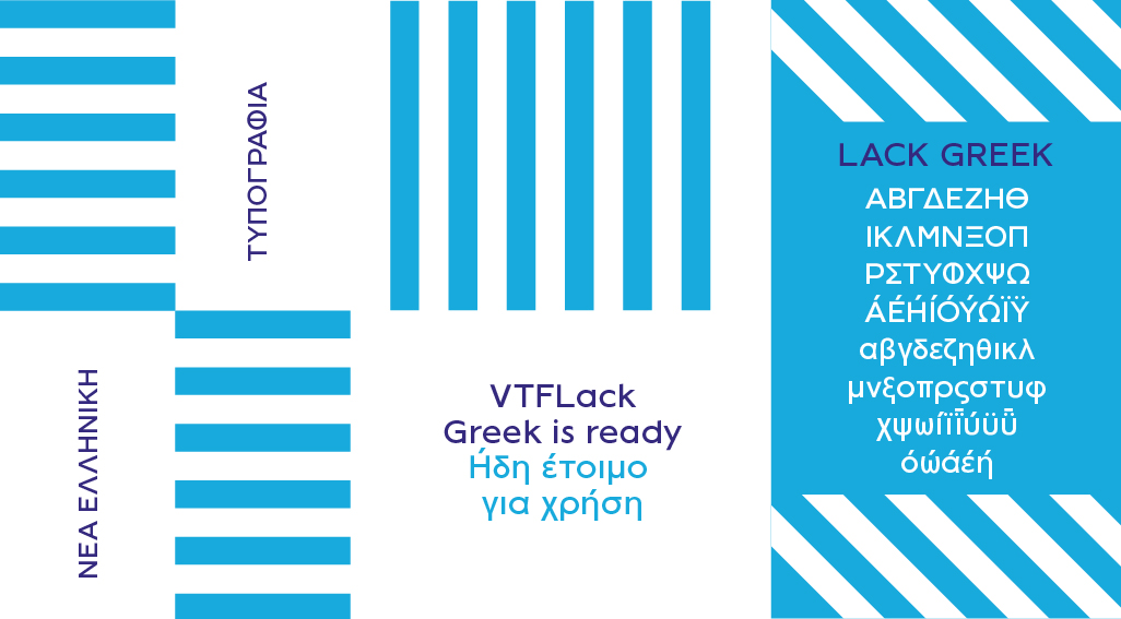
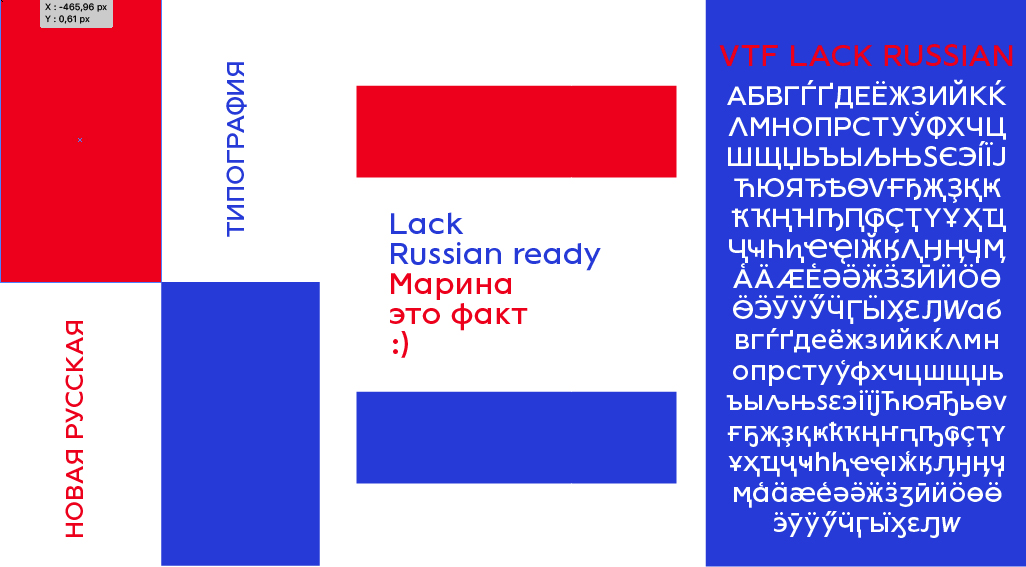
Travels is always a good thing, in 2017, Adrien went in Greece for vacation and had the idea to try to make a greek font on his come back. Lack was a perfect typeface for that. He draw the greek letters inspired by his own shoots. At the same time a russian friend come in his life, and he decides to make Lack a real multilungual font! It helps him to draw the letter to make any mistake, because like the Greek alphabet, Cyrillic is really different.
Lack are being met
So in 2018, both of visuals and linguistics missing of Lack are being met.
VTFLack is now updated, it is a brave, contemporary and experimental typeface. It gives you the opportunity to compose in Cyrillic, Greek and latin. It comes in a single weight with her Italic. It started by extending the first VTFLack font edition, designed by Adrien Midzic in 2013. It works well as a display typeface, but is also designed to perform in all kind of texts sizes. Some crazy surprises are hidden into 3 stylistics sets.
Now the Lack’s emblematic set with its crazy uppercases is available in two stylistic sets called O.V.N.I-1 and O.V.N.I-2.
Another set named “Alternate” has also been created, in which alternative forms for some tiny ones are available.