We design libre / open source fonts. Learn more and contribute to the adventure of Velvetyne by reading our “about” page.
Trickster, a postmortem
When we released our latest typeface, Trickster, at the end of 2017, we also hosted a poster exhibition showing creations from 14 designers, who designed beautiful applications for the font. The event took place at La Générale, a place collectively managed by an association. As its website puts it, La Générale “is a laboratory made for creation — cultural, artistic, political or social.” This former electrical substation in the heart of Paris was the right place to show our exhibit. We designed posters, asked friends and personal heroes to do the same, and we ended up with 14 fantastic propositions of how to use Trickster — a typeface that looks barely legible at a first glance but that resulted being perfectly functional for designers.
We hung up the posters, created a medieval mood for the event (the flyer, the food, the name) and invited our fellow type and graphic designers, or any regular John who wanted to discover Trickster, to come by and say hello.
If you missed the exhibit, don’t be sad, because the party continues: you’ll be happy to read a few words that the author of Trickster —Jean-Baptiste Morizot— wrote about it to explain its influences, the origin and the reasons of this animal. You can discover some pictures of the event in the corresponding blog post too.
The making of Trickster
Trickster is a libre font I released at the end of 2017. When the Velvetyne crew and I released the typeface, I called it “a smooth blend of Merovingian writing, blackletter influences and contemporary shapes”. It’s a smart way to say I don’t know how to label it properly. The design being quite unusual (call it weird or ugly if you want, but at least it’s not your usual Helv), I thought it could be interesting to write about its development and what lies behind its design decision

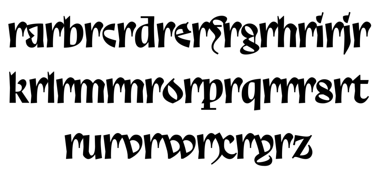
Trickster was born from one of the sporadic frenetic pen and paper doodling periods that I have (between two periods where I make all my essays on the screen). Among the many letters I drew, there was this radical and unusual a. I liked it so much I drew it again and again until I switched to the computer and then I designed the glyph directly with Bezier curves.
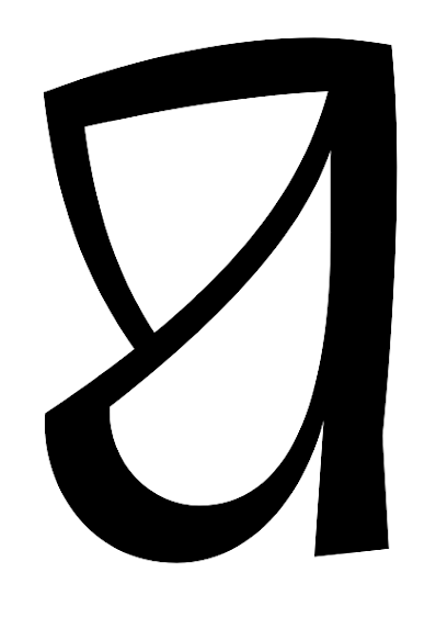
This letter was a challenge: how to derive an entire typeface from this atypical letterform? Was it even possible? At that time I perused a lot into a kind of medieval calligraphy called Luxeuil writing (or Merovingian writing). Merovingian writing is quite illegible now because of its many ligatures, forgotten letters constructions, and the use of a writing tool that allowed to go back from the bottom to the top of the letter shapes and which caused very dark stems (you don’t do that usually in calligraphy).
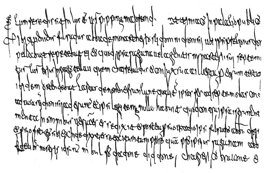
Laon Writting
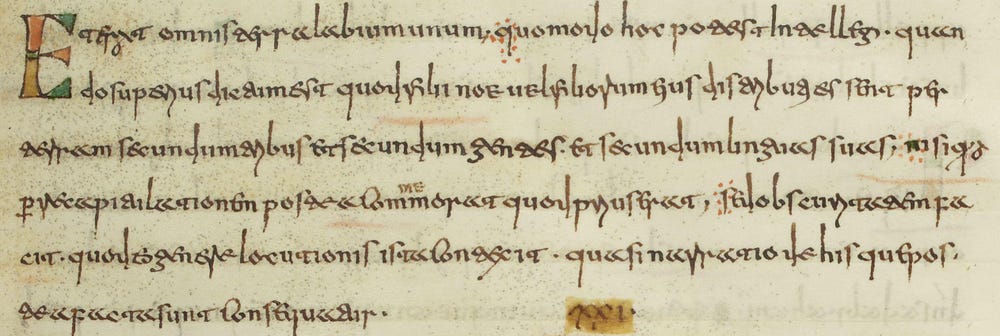
Guessing that the Luxeuil writing I was looking at so fondly may have impacted my design, I loosely used some of its shapes and tried to mix them with the a. So my first sketches looked like that:
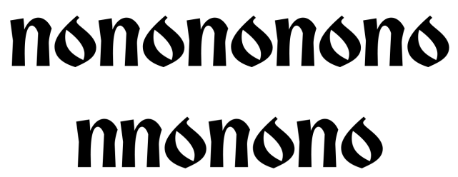
The g came from the Merovingian construction, like the o, while the square-like m and n were influenced by the a. The open head of the g, with the descending end of the loop came from the writing tool and from the need of the calligrapher to stop his/her gesture when writing. I suppose it could be also be linked to the need of exhausting the ink on the paper in order to avoid stains when lifting the pen to start writing the next letter. So even if it was a calligraphic feature with a justified reason, I couldn’t help but seeing a drop of blood flowing (we’ll talk about it later). The typeface had a Blackletter feeling, so I shifted promptly towards a bolder weight. Letter shapes followed the hand’s movements, so I redesigned m and n in a more classical way. The p, n, m had now a really calligraphic voice (yes, the dot on the i is a mess, and curves are generally wrong).
The stems were broken like in some Blackletters models, but I suppose that Infini — a font I’m really fond of — influenced me too. It’s a feature you could think was outdated until recently, but Infini made such a good use of it, that it showed us that it was still relevant today. So I jumped on the train.
I liked the way it looked, so I dug my ideas deeper: I made the weight even bolder and quietly started designing the remaining lowercase and capital letters.
Street Cred
Disclaimer: I’m not a tag addict; I don’t know anything about it (or very little, thanks to my fellow colleague Elliott). But I work in a neighborhood where tags bloom on every corner shop. I can’t tell much about this or that tag, crew or style, but I like their gestures, I like how they flow — so I unintentionally started merging some of the stylistic elements of the street in my design. They’re obvious in those several versions of the f.
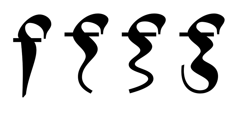
Eventually the second one was kept (and a modified version of the third as alternate).
This f was quite a challenge because it had a lot of white space on its right, and in the same time it blackened the word when kerned to correct this issue. I had to find the right balance.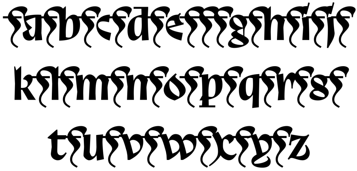
And it needed some ligature substitutions to work properly. Even a i+f+i solution: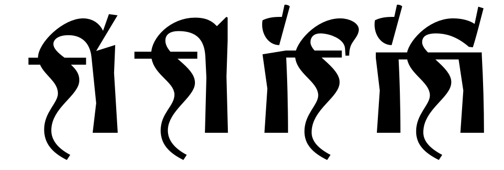
Other letters received this kind of street look medication, mostly in alternate shapes; like this creamy/burger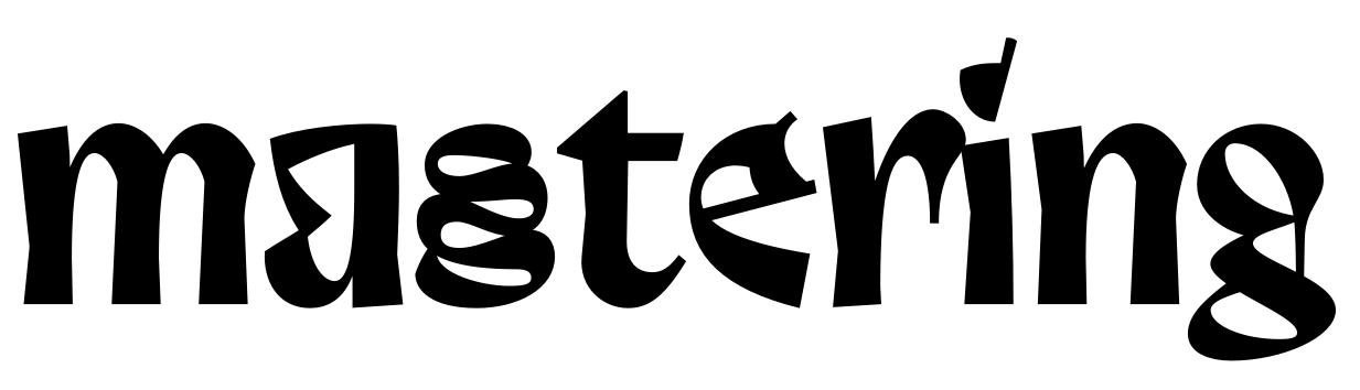
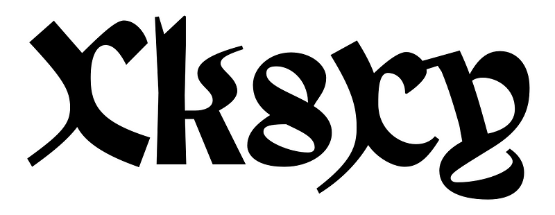
The X and x, the alternate k, the s, etc., could be classified according to the same design decisions: gesture, gesture, from the past and from the streets.
K I S S
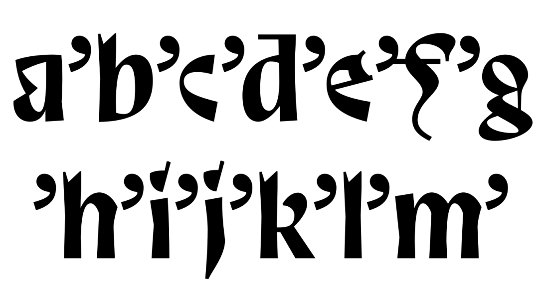
So tags were a good inspiration, but the typeface needed to work its medieval-ish look (a half-serious, half-pop culture medieval look). So I started making the uppercase letters this way:
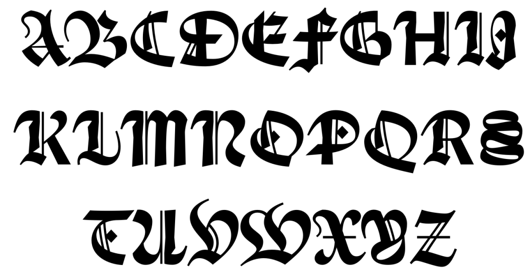
I was unsure about it: they were fun, but those very calligraphic, lined Blackletter capitals felt too cliché. So I started to doubt about them and trying a more simple design approach (thanks Jérémy for your input on this topic). I kept the structure, but cleaned the design (see the A). I added spikes to ornate the stems a little bit, and I used my tag trick to make them bouncing (upper diagonal of the K). The O and Q are a good mix of this calligraphic/tag/simplification solution. Even the P, X, V, U letters try to retain and spread the gesture in a half-calligraphic, half-contemporary way. To me, the S; with its curvy loopy movements has a really street-like structure. The M has a fun design, looking like the signature of a comic book super-villain.
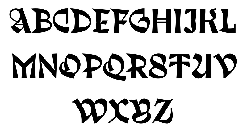
This helped me to better understand what Trickster wanted to be: a blackletter for the 21th century. So I started to simplify and to clean the lowercase too, but without loosing the warmth and the softness of the calligraphic gesture.
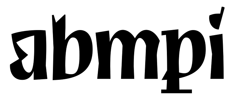
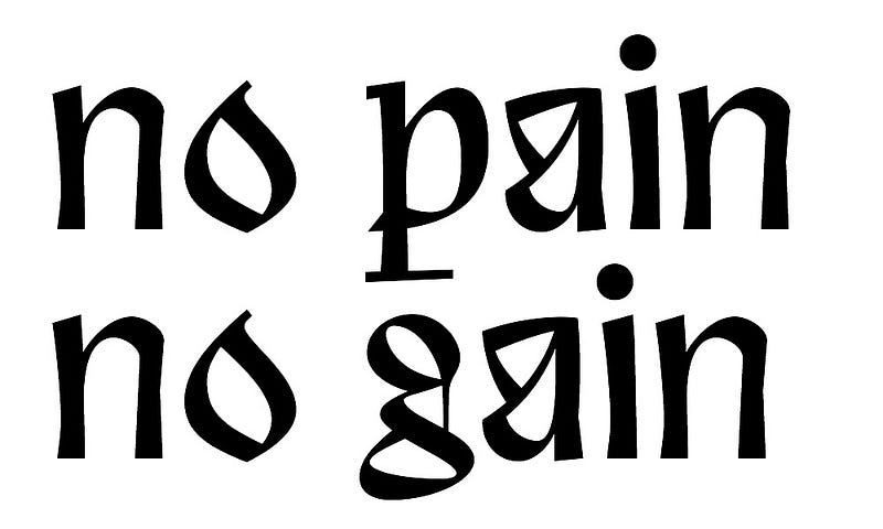
The a is a good example: it looses its inner upstroke, which simplifies the shape, and which also brings a more contemporary voice to it (the inner counter is quite graphically expressive). But, if you look closely, you’ll see that the lower upstroke that ties the bowl to the stem keeps a calligraphic style (and so does the attack of the n, m and the p). At the same time, letters like the c could be seen as oversimplified compared to letters like the p. The c is indeed very geometric-looking (notice the wide empty counter) but the human gesture can still be seen, so the words are allowed to flow when all the letters are combined together.
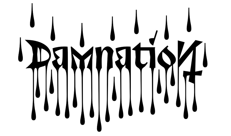
Drip, drip, drip
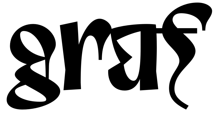
I’ve already told you about the Merovingian g. I liked its dripping open head, so I repeated that feature on some other letters, like the r. (The f kind of relates to it, even if it’s more similar to graffiti and was influenced by a medieval weapon.) The r rises above the x-height because that’s the way that Merovingians wrote it, so in result it adds rhythm to the text. It’s an interesting shape, but it kind of overlaps every other sign in order to avoid white gaps in the text. Therefore, it creates black spots when merging with stems on its right side. You could rage on about it, but to my eyes this creates original patterns, so I kept it this way.
Still, these terminals didn’t feel as they were dripping as much as I wanted, so I made their alternate versions go berserk.
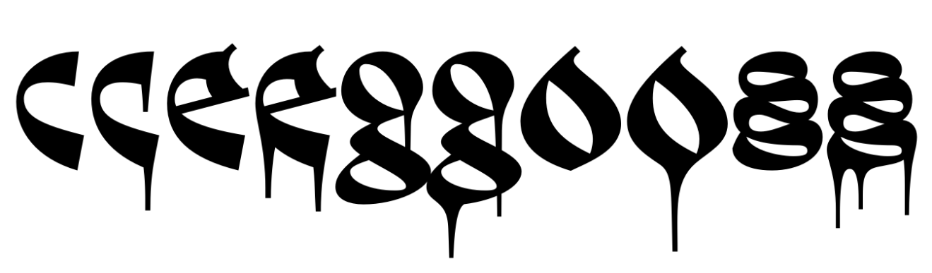
They’re just 5 letters (or even less if you don’t use the alternate s), but they can change meaningfully the look of any logo or text set with Trickster.

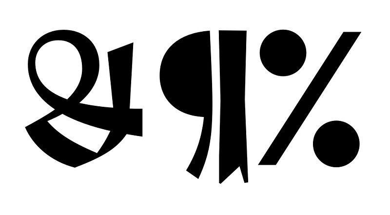
In addition to this bloody stylistic set, I incorporated some fancy stuff, like a long tailed y that can go beyond letters the letters on its left but only if they don’t have descenders. And a swash e. And many other alternate letters. Take a look to the OpenType features of Trickster, you’ll find things to spice up your design.
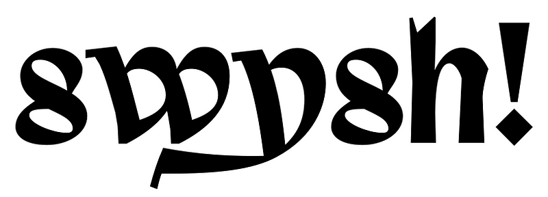
Swashy y.
Go figure
Figures were another struggle for me, similar to the one with capitals letters. I made several attempts at them with useless ornamentation and oddities. But I wasn’t convinced yet.
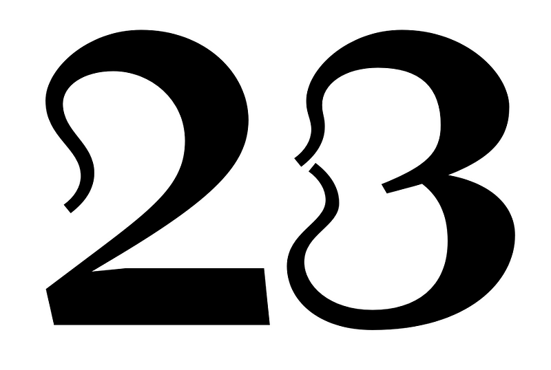
Following the design of the uppercase, I chose a sharper approach. See how the 2 makes a loop that creates a geometric shape. The 6 and 9 combine a style without contrast and contrasted elements. When I found the right formula for them, they were easy to draw. Then I adapted them into old style figures.
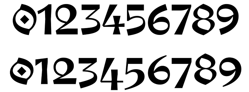
The punctuation was a fun thing to do as well. I started with a diamond-shaped dot, then I derived the comma from it and it started working immediately. The ? followed the style of the 2. Finally, the hyphen is more like a frenetic gesture that almost resembles a scratch — and that fills the space quite well.
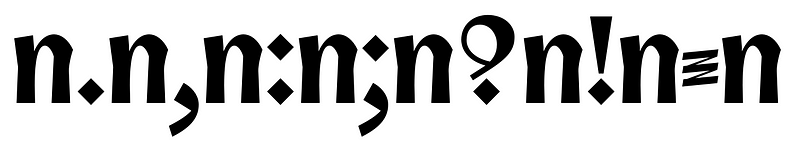
For the quote signs I didn’t reuse the comma as it was, but I increased their curvature and I also changed their upper extremes to make them rounder (which integrate in a better way with the rest of the words in the sentence).
Finally, the more decorative stuff like &, ¶, % was easy to do =)
End of the journey
If I need to summarise: Trickster is a Blackletter for the world of tomorrow. But to promote it today, we made a poster exhibition showing creations from 14 designers who played with it. The event took place at La Générale, a place collectively managed by an association. La Générale “is a laboratory made for creation — cultural, artistic, political or social.” This former electric substation was the right place to show our exhibit. We hang the posters, created a medieval mood for the event (the flyer, the food, the name) and invited all the designers and curious people that want to see Trickster
I designed one poster, and mused on my own font to create an original lettering. Since Trickster is a libre font, you can do it too.
One of the sketches for my poster.
Thanks for reading.