We design libre / open source fonts. Learn more and contribute to the adventure of Velvetyne by reading our “about” page.
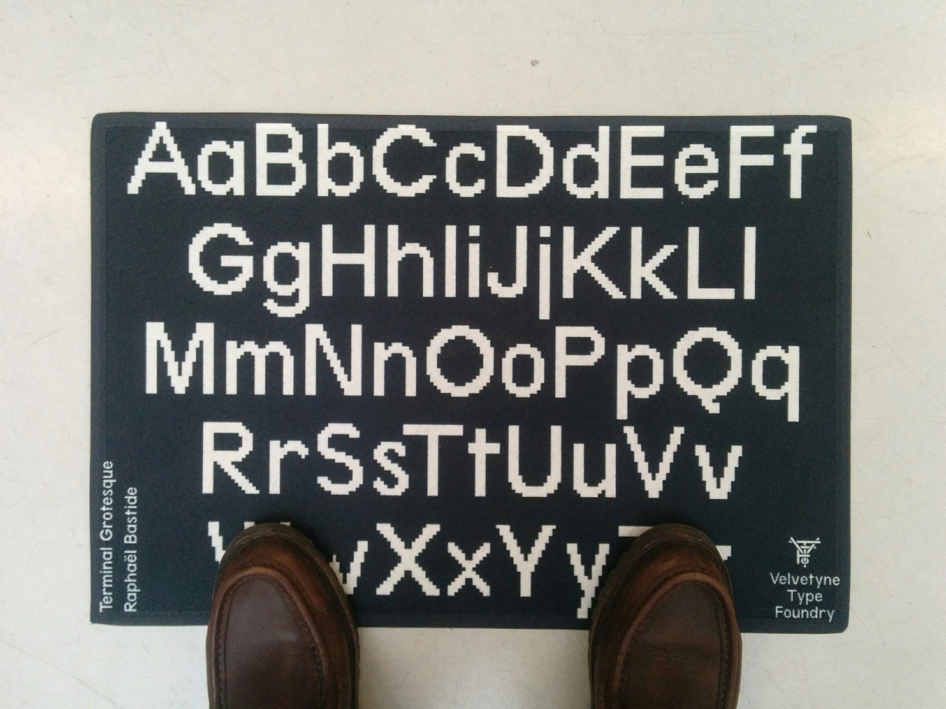
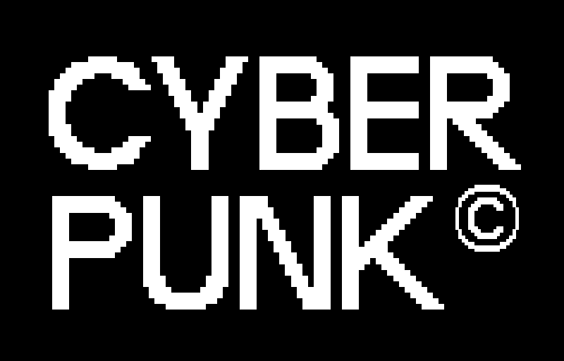
Terminal Grotesque
sine, sawtooth, square, triangle
sine, sawtooth, square, triangle
Designed by
Styles
- terminal grotesque
- terminal grotesque open
Writing systems
Date
Published on November 2, 2011
A cousin of the pixel fonts but enhanced enough to be organic while staying punk and technical.
Project initiated by Raphaël Bastide. Jérémy Landes forked it to create the open version.
Raphaël talks about Terminal Grotesque
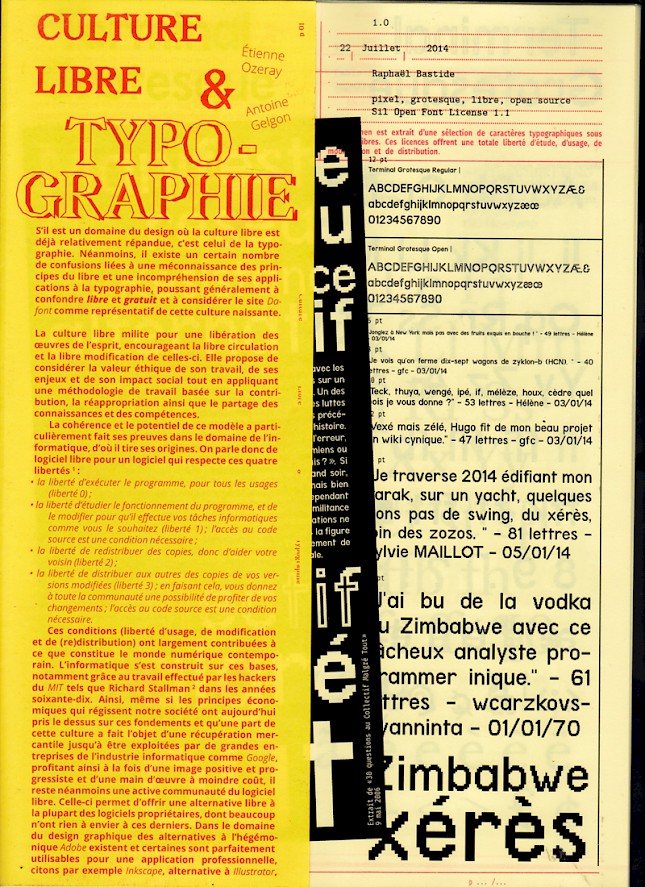
Terminal Grotesque is a font that I started in December 2010 while working for a game project, on a pixel font called Modulicon. The characters of Modulicon are not alpha-numeric but a series of icons designed to be displayed in small sizes. After some time spent completing this font, working with pixels made me want to start another drawing that could be used for titles within higher sizes. This side project, was given the temporary name of Junkette and then became Terminal Grotesque: a pixel font inspired by Paul Renner's Futura and some features of Radim Peško's grotesque drawings.
The first versions of Terminal Grotesque were designed using the online app Fontstruct. Later, the project migrated to the open source software Fontforge.
The design and production of Terminal Grotesque were simultaneous, so the typographical details are refined during the versions. The constraint of the pixel as a module element causes certain curiosities that are sometimes difficult to circumvent. This personal exercise has no specific purpose except to help my initiation to typographic drawing. Such work, in my opinion, should not be finalized, its status as a "Beta project" is suitable for its perpetual modification.
Terminal Grotesque is and will remain open source, i. e. freely downloadable, usable and modifiable by everyone. Thus, it will benefit from the modifications of its designer but also from the contributions of other authors who have decided to modify it. This principle is no longer reserved for the code, but extended to texts, images, machines and ideas.
Terminal: In computing, a terminal refers to a set of output devices (screen...) or input devices (keyboard, mouse...), in a way the end of a network. Grotesque: or "Grotesk" in German, is frequently used as a synonym for "without serif", i. e. without serifs in typography.
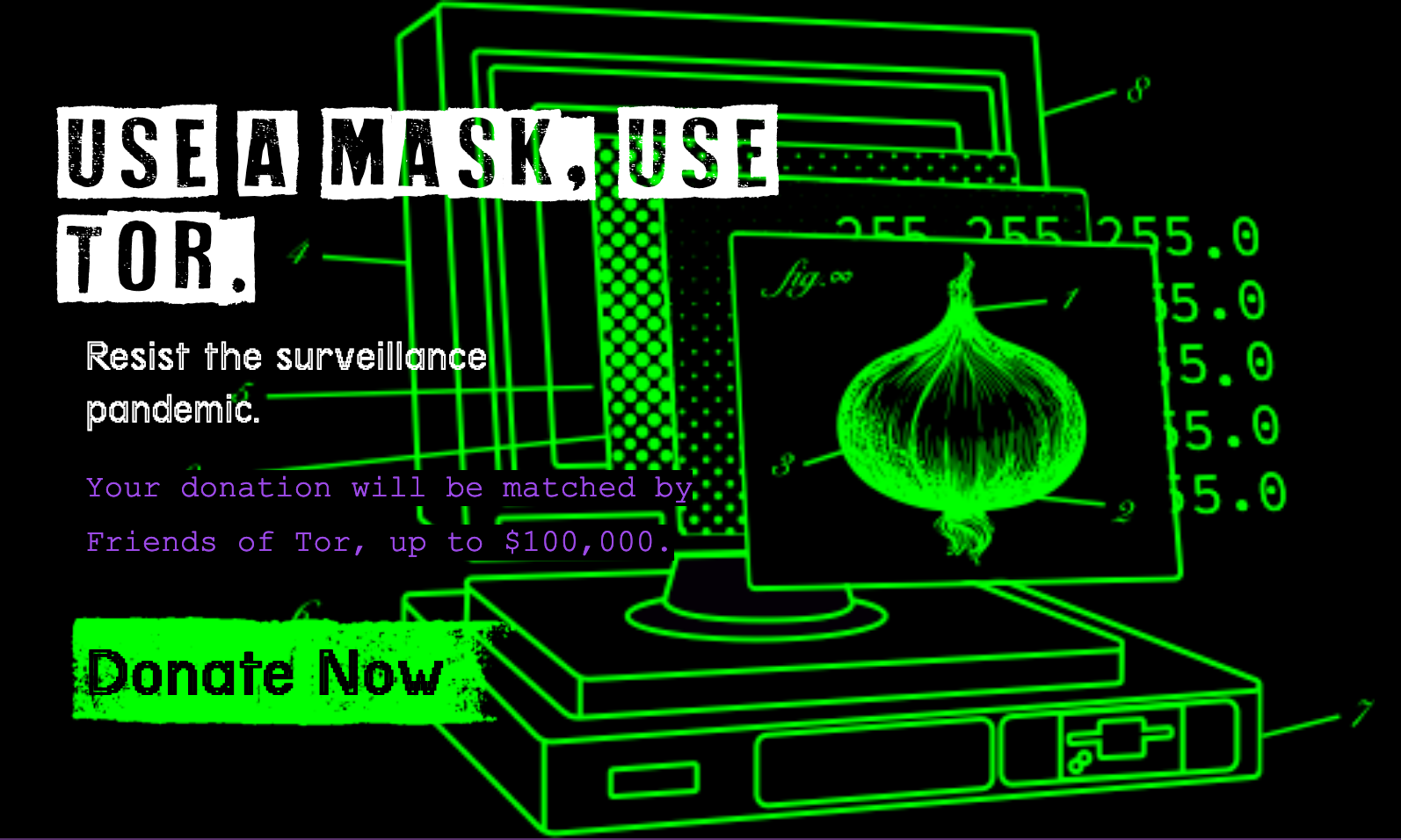
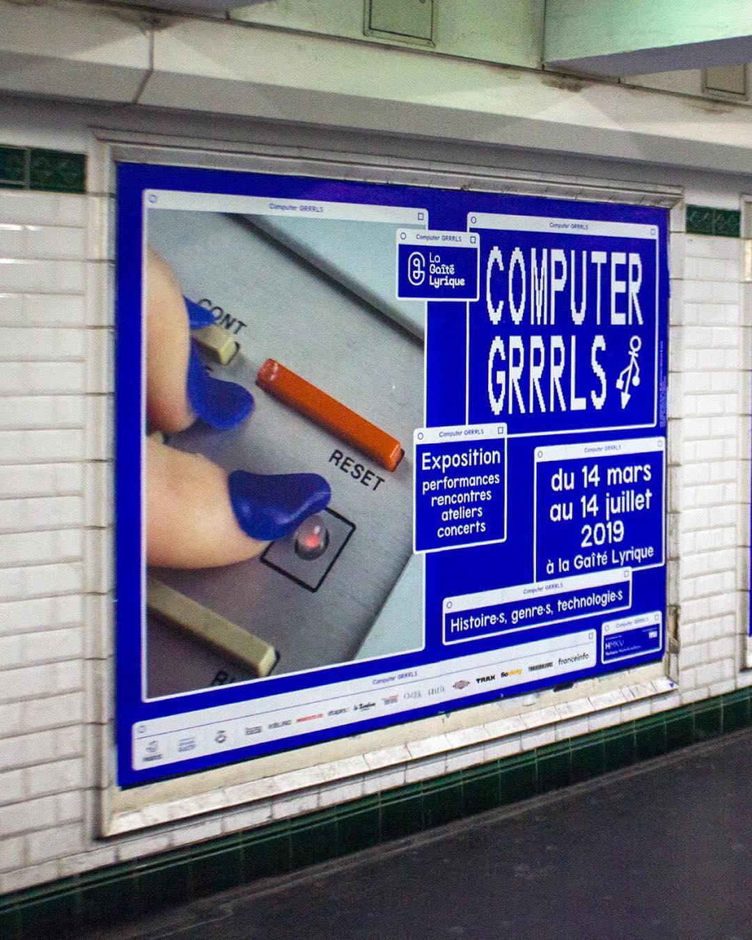
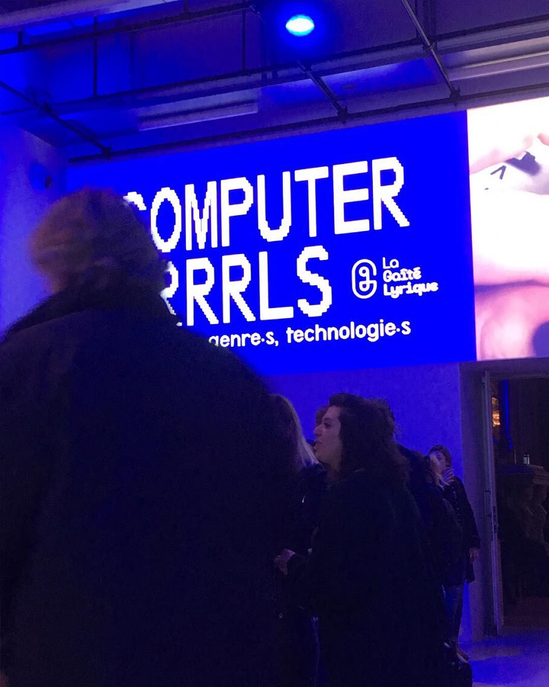
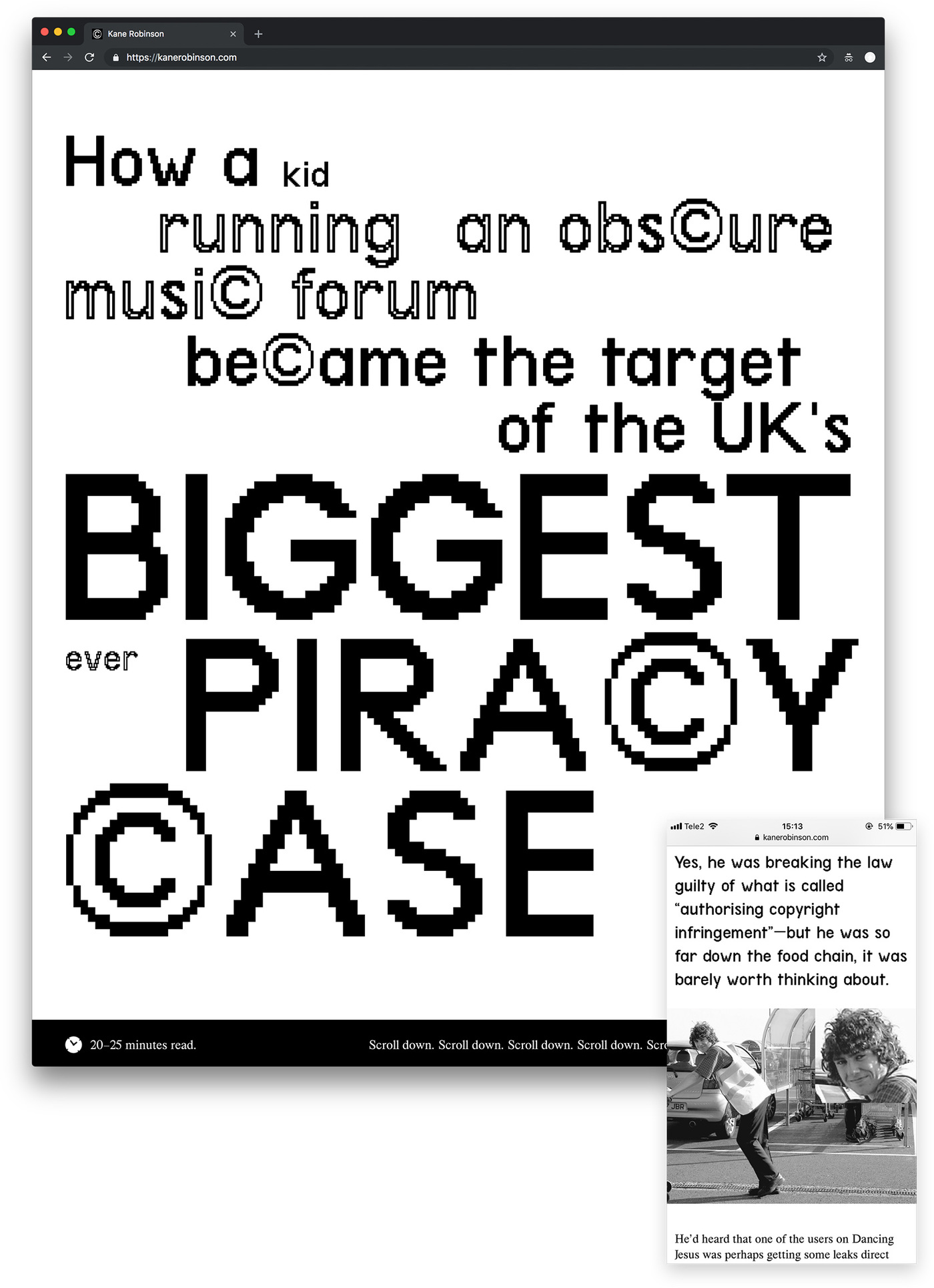
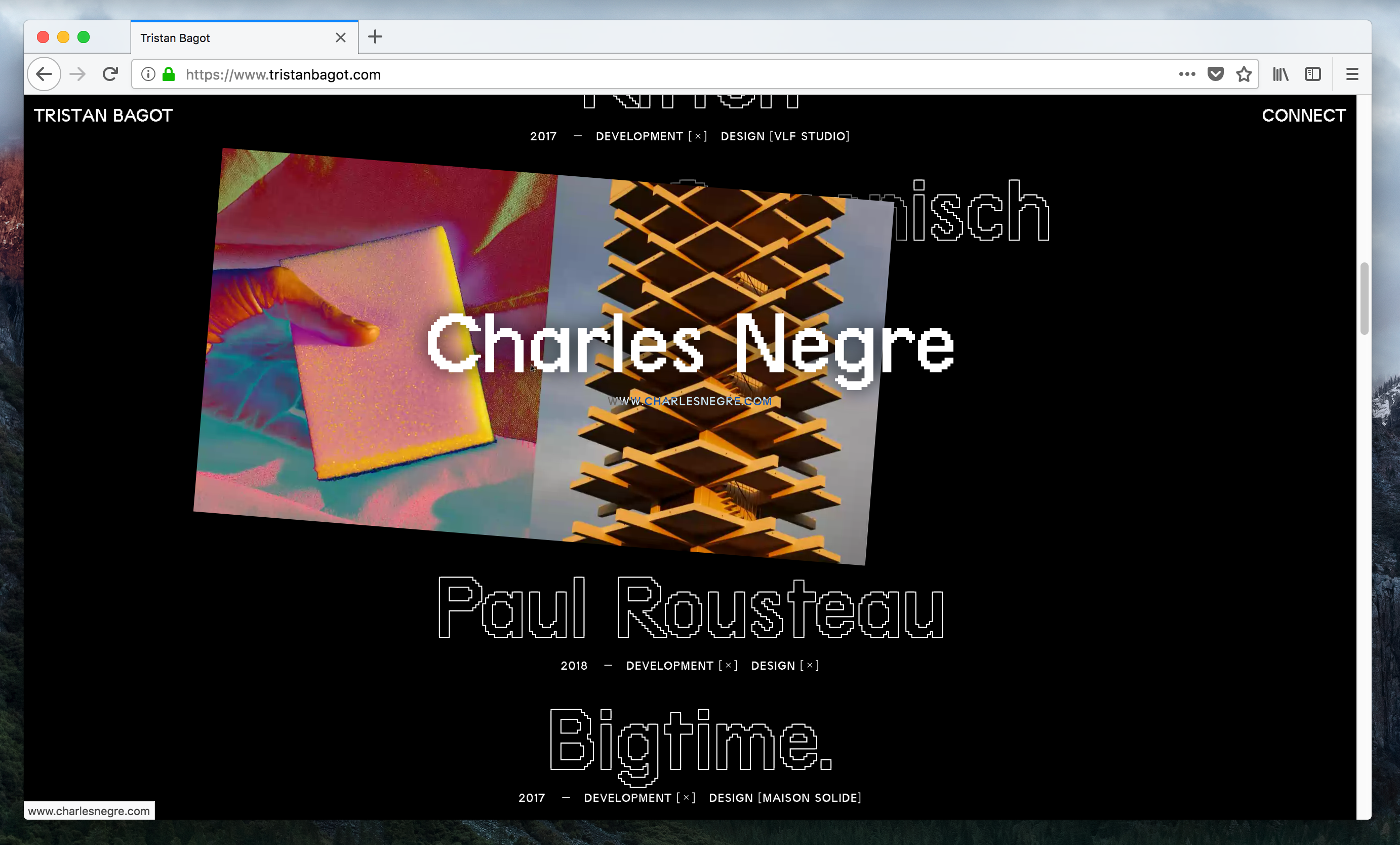
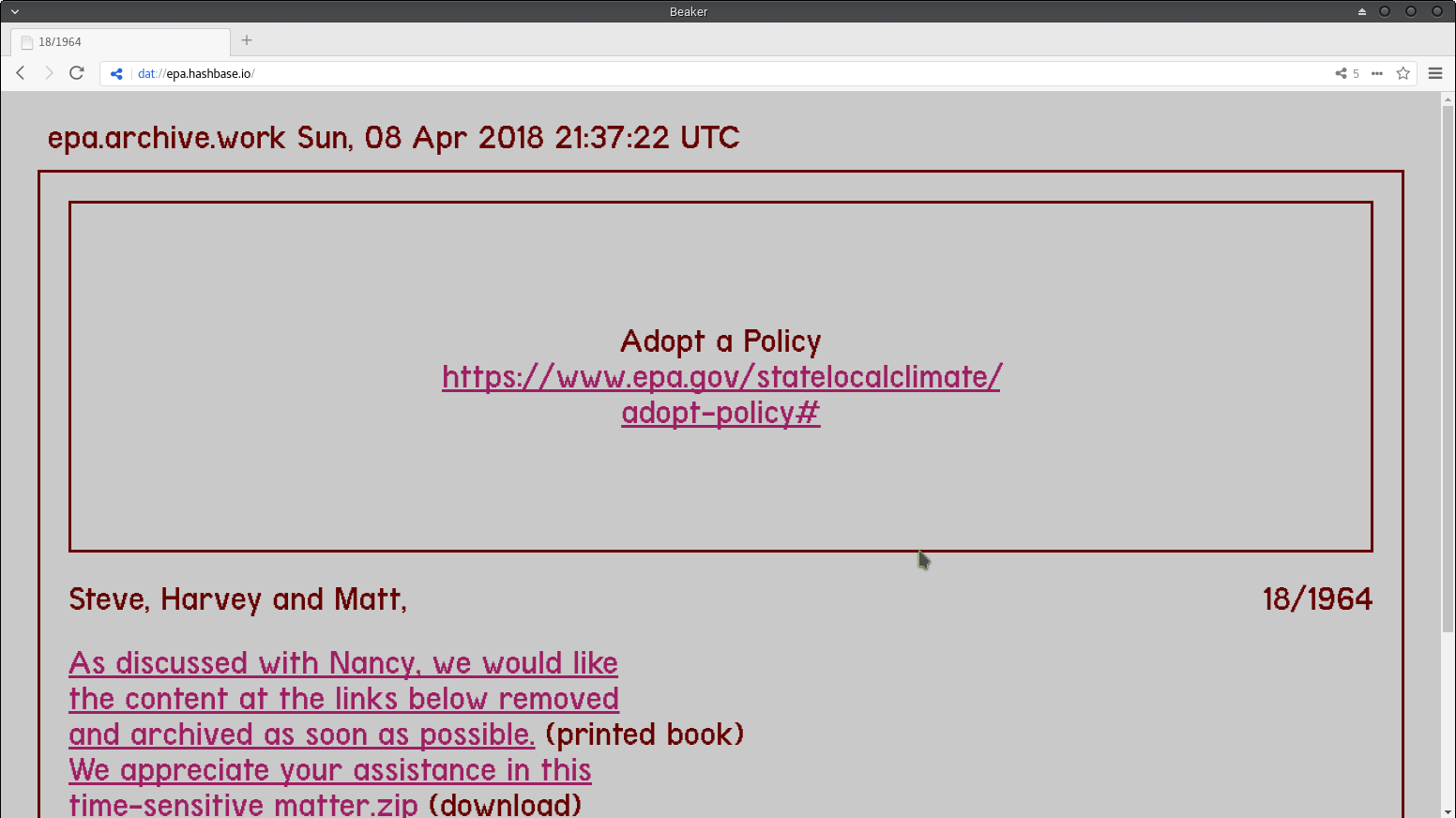
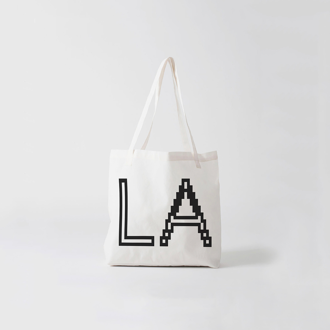
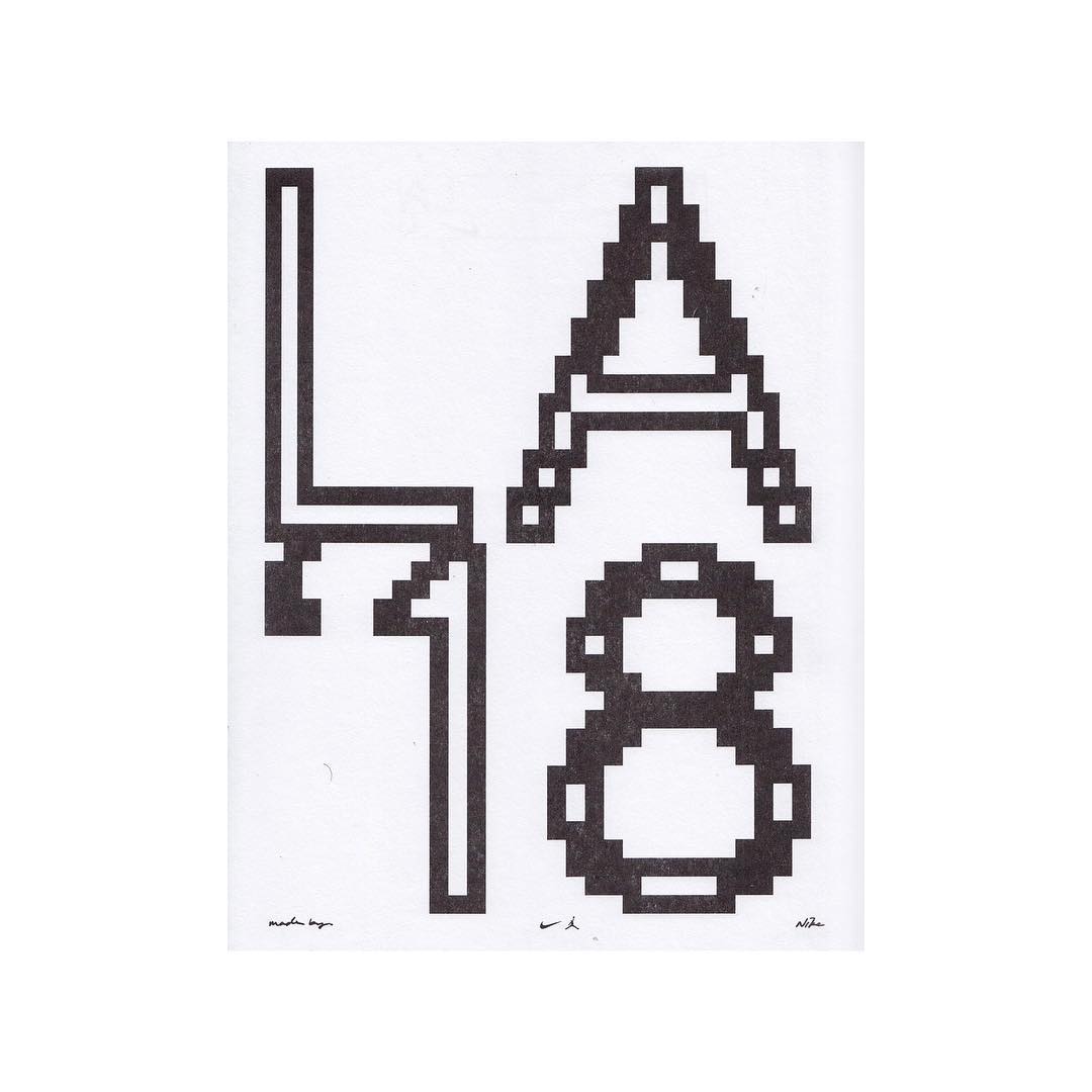
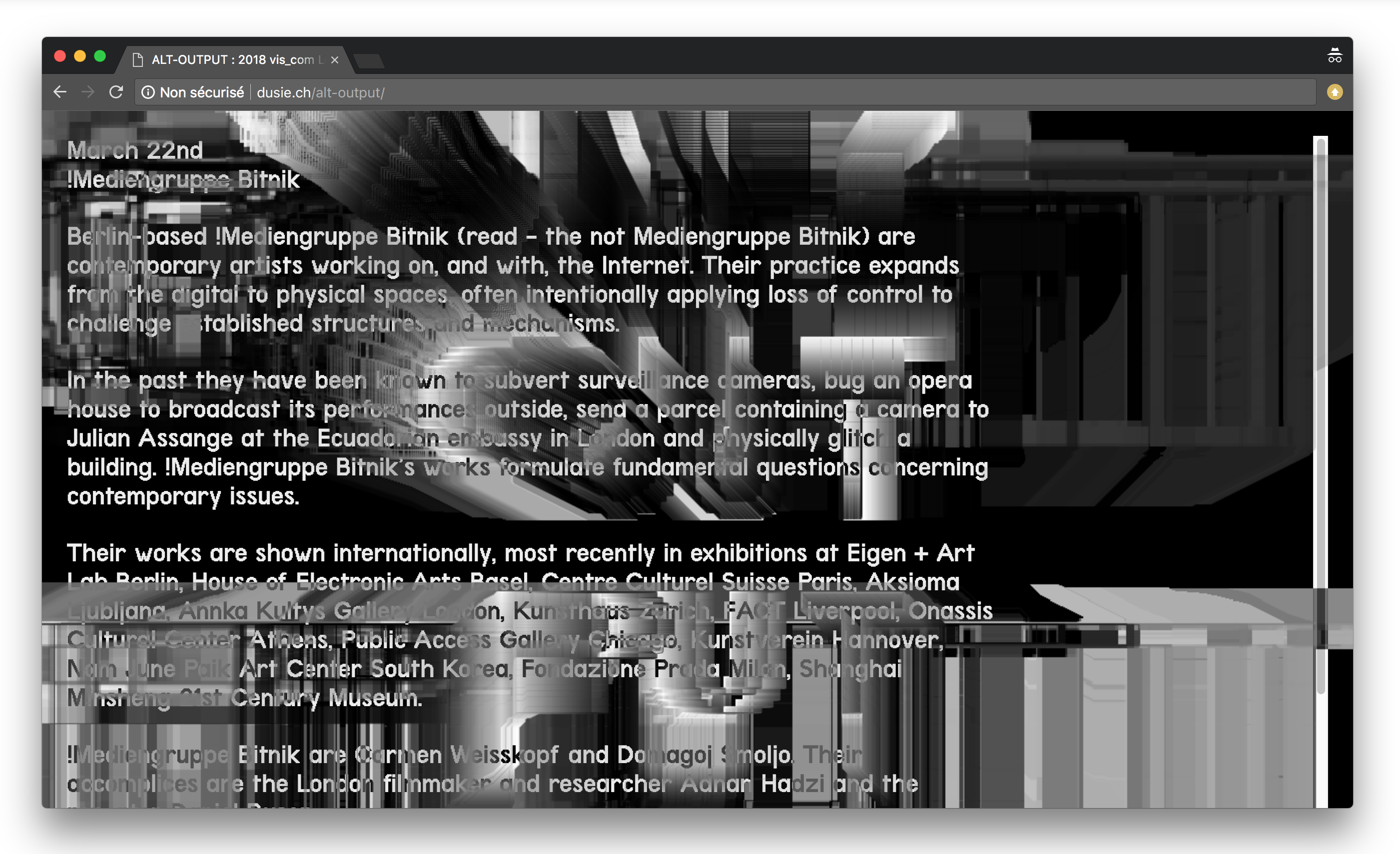
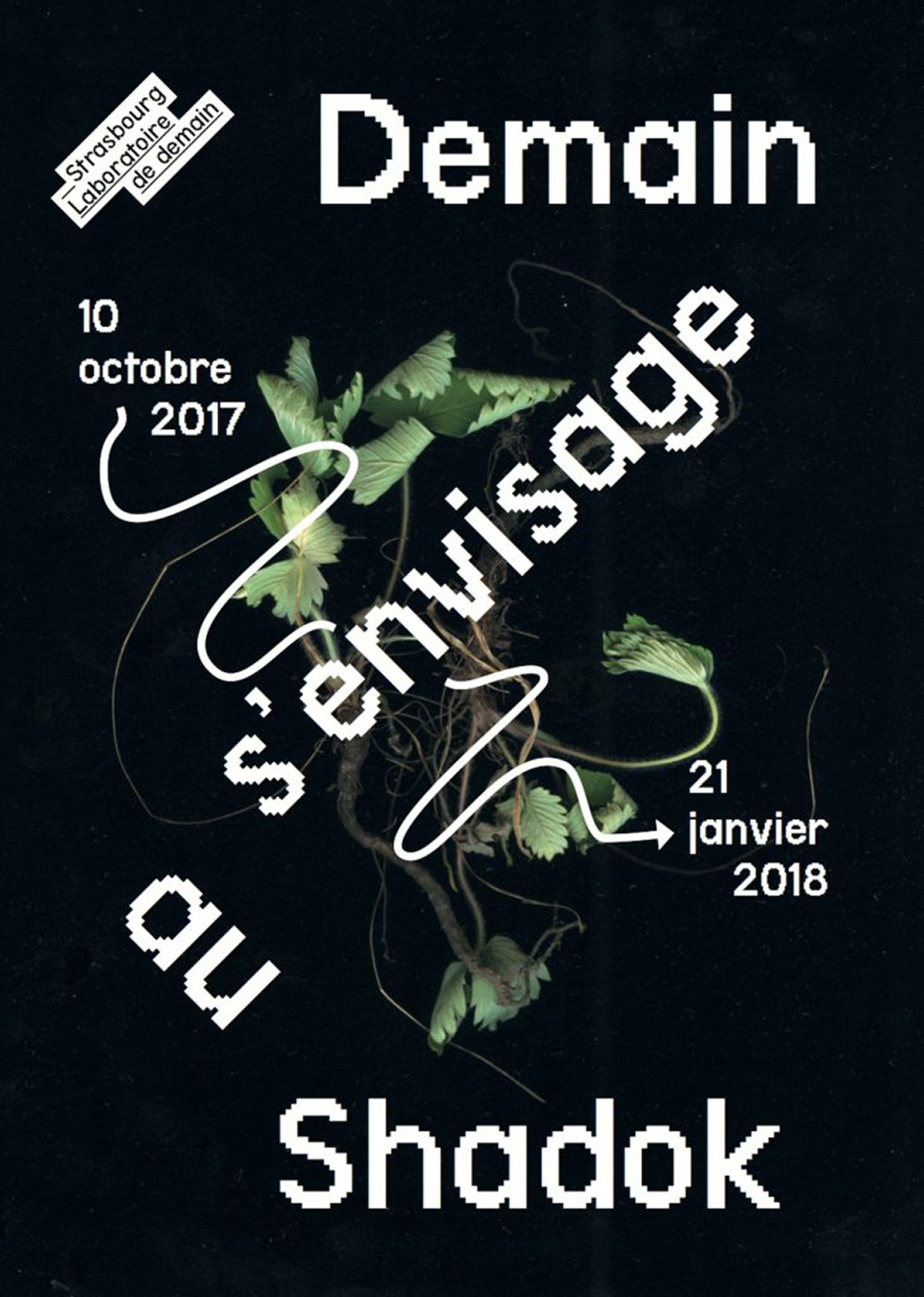
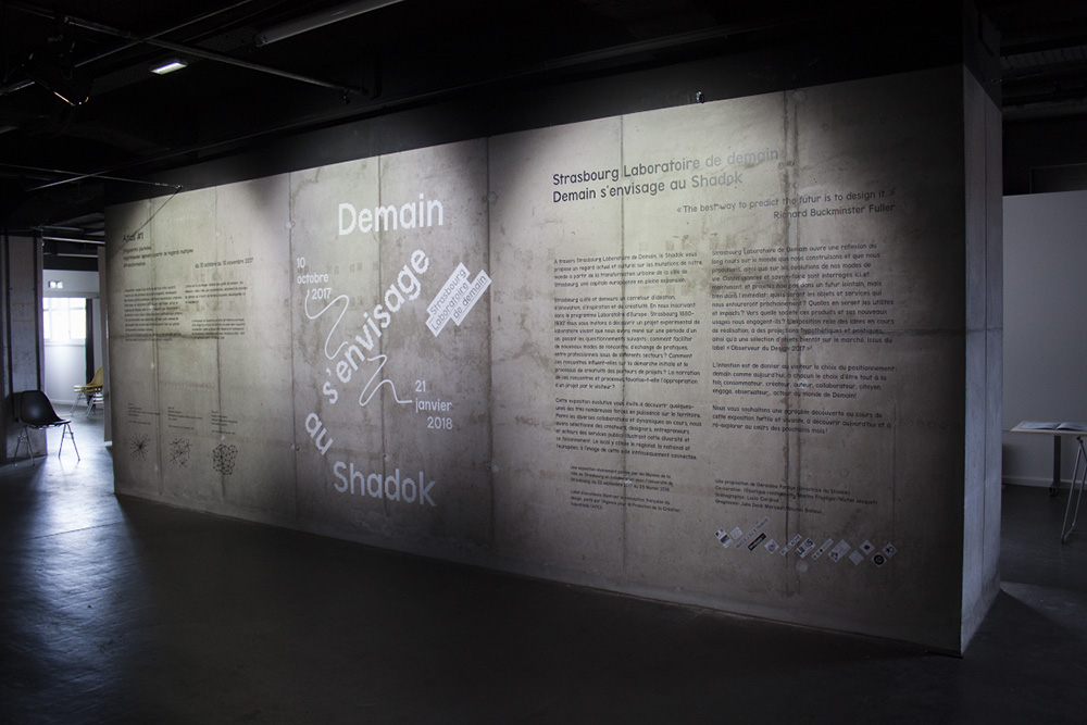
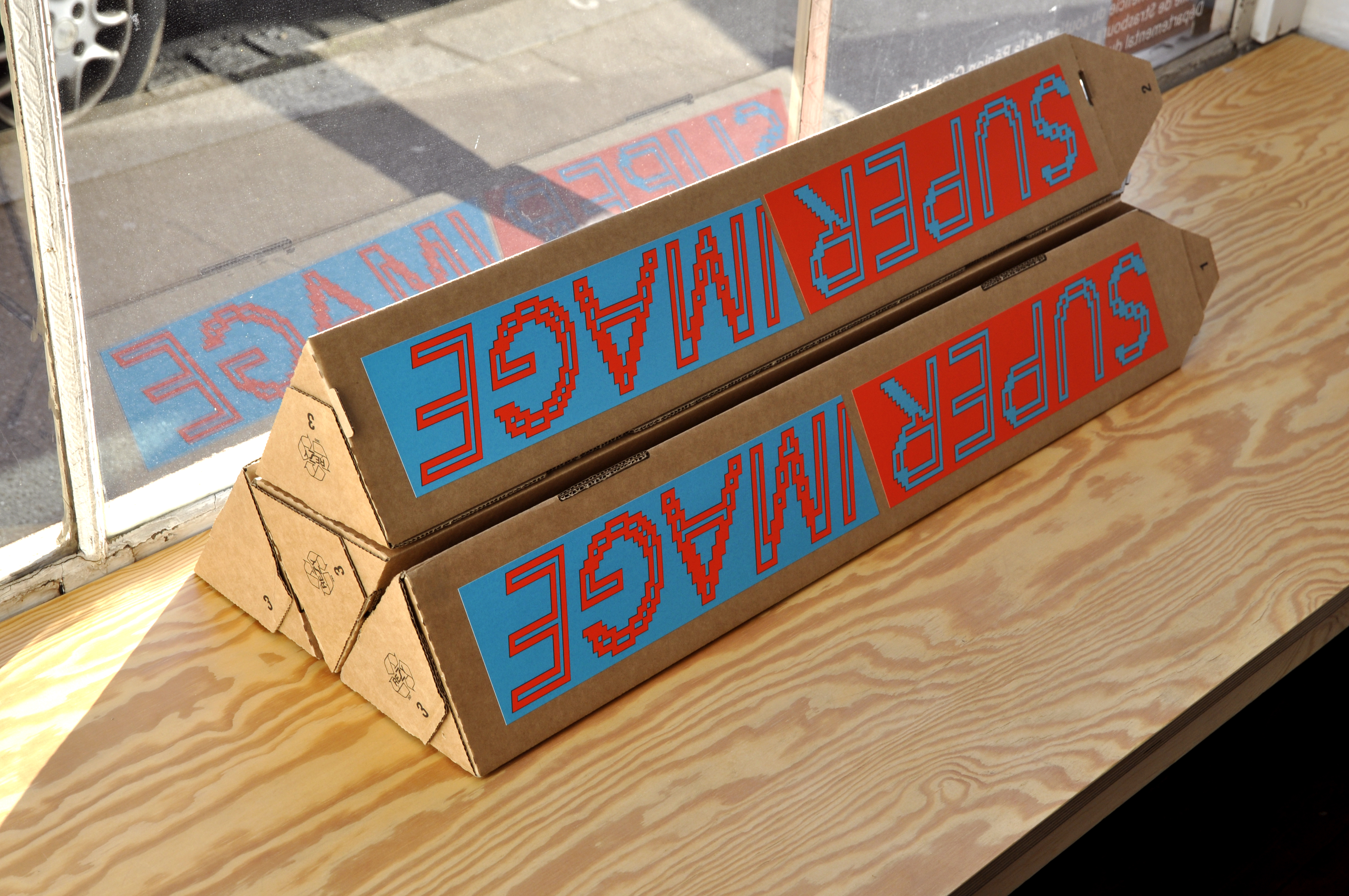
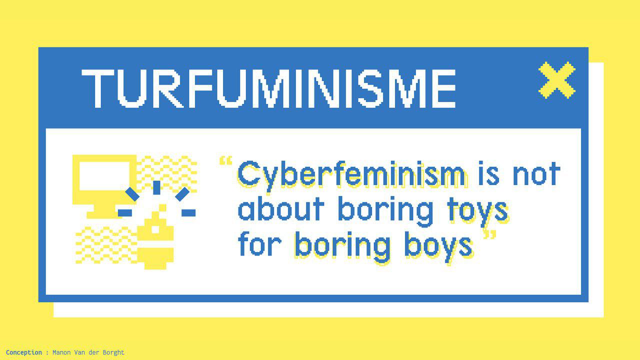
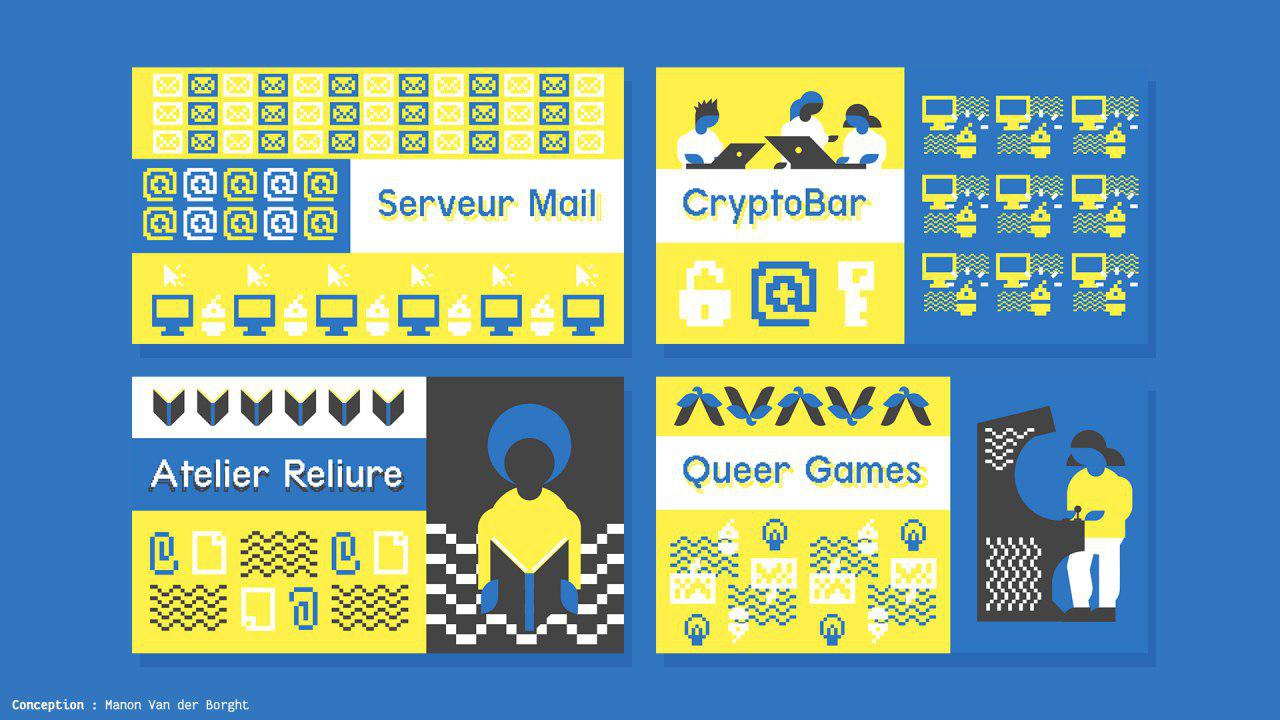
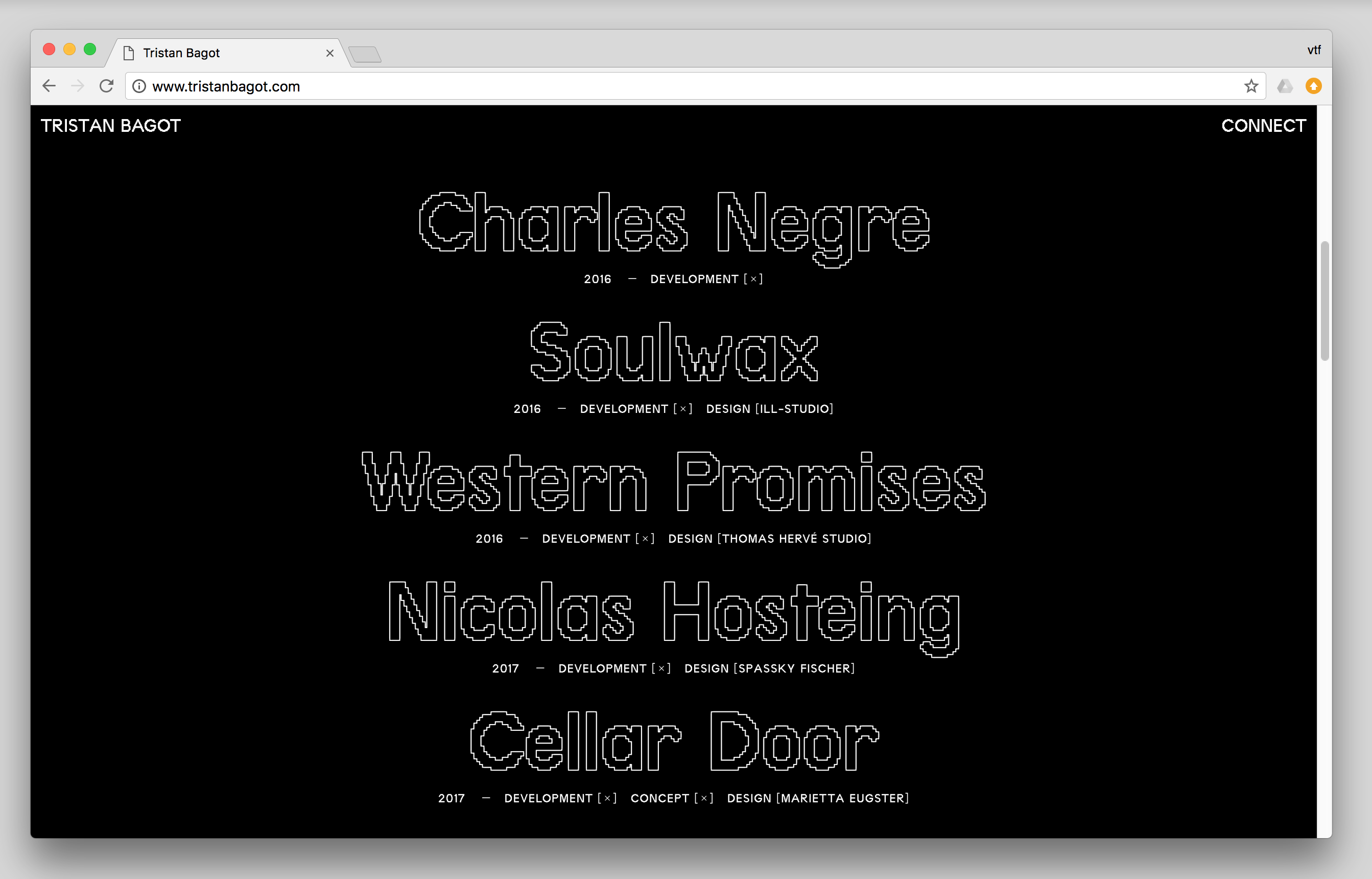
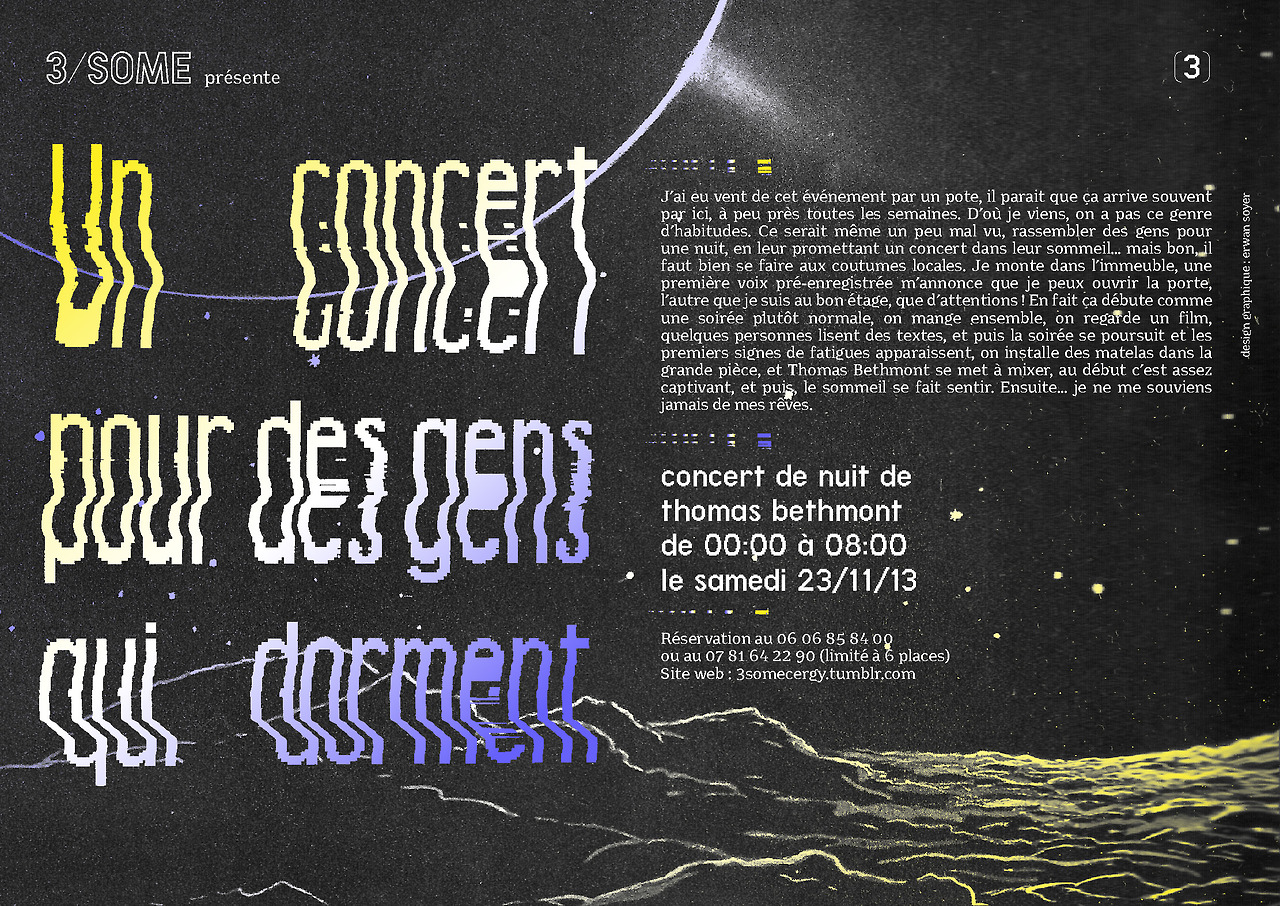
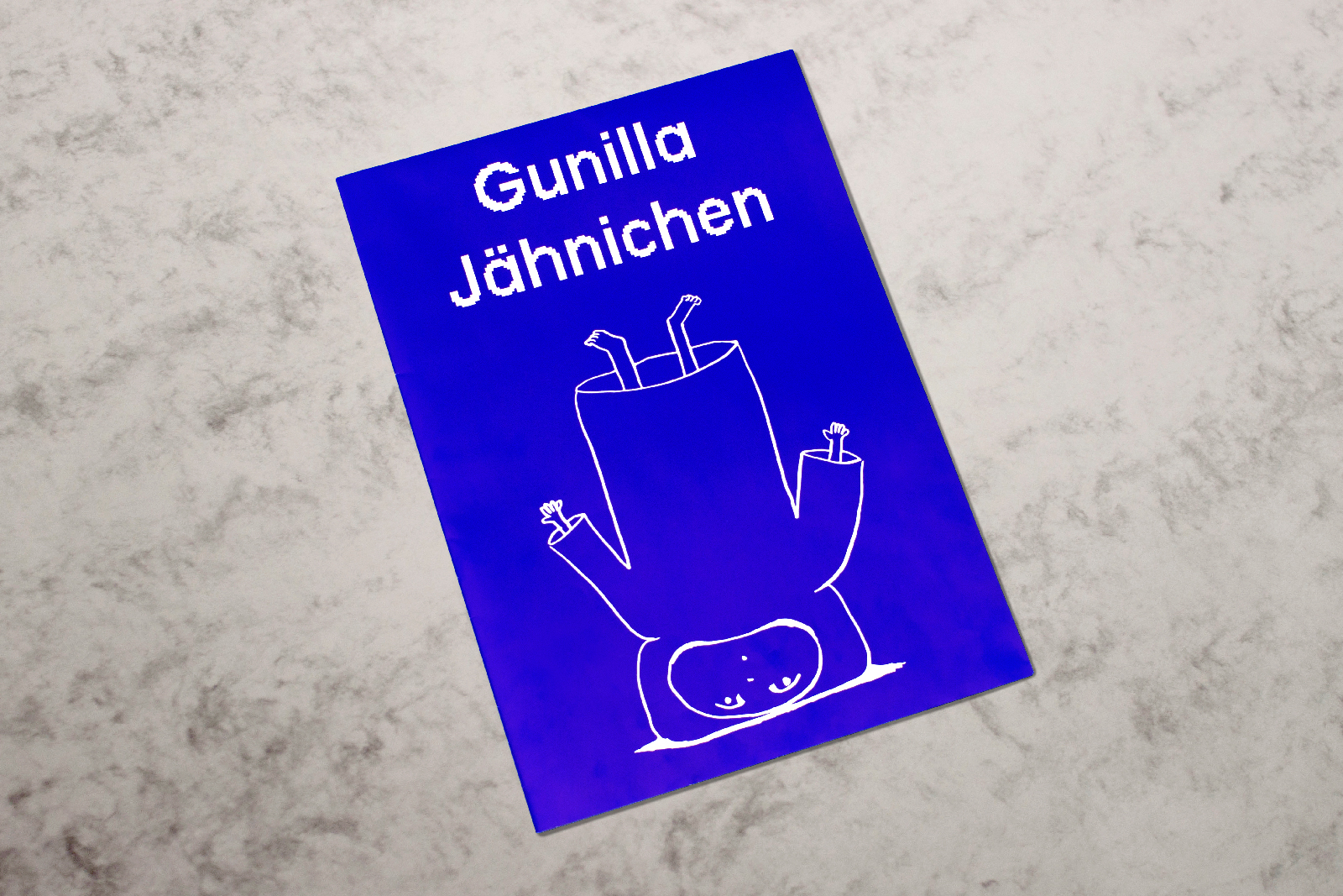
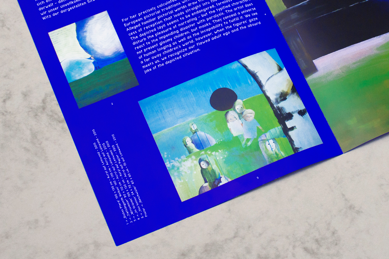
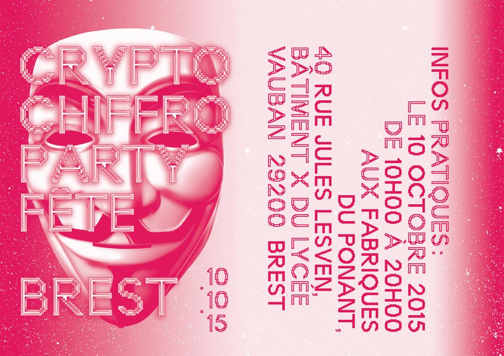
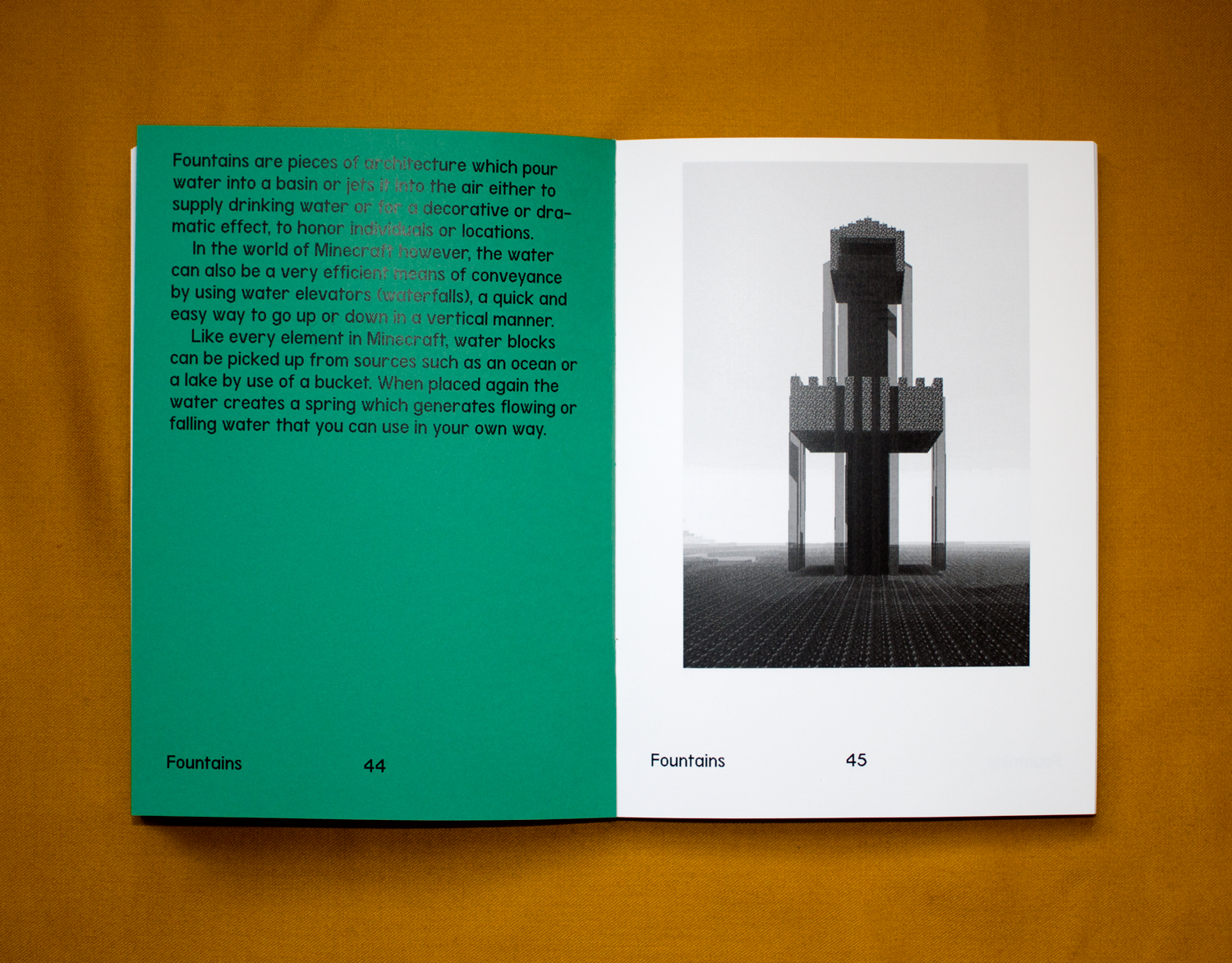
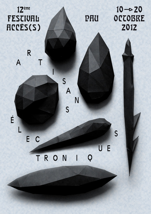
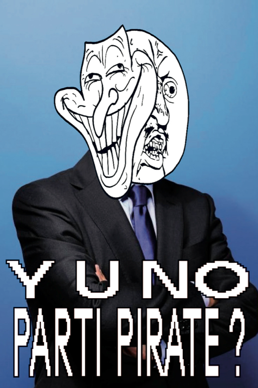
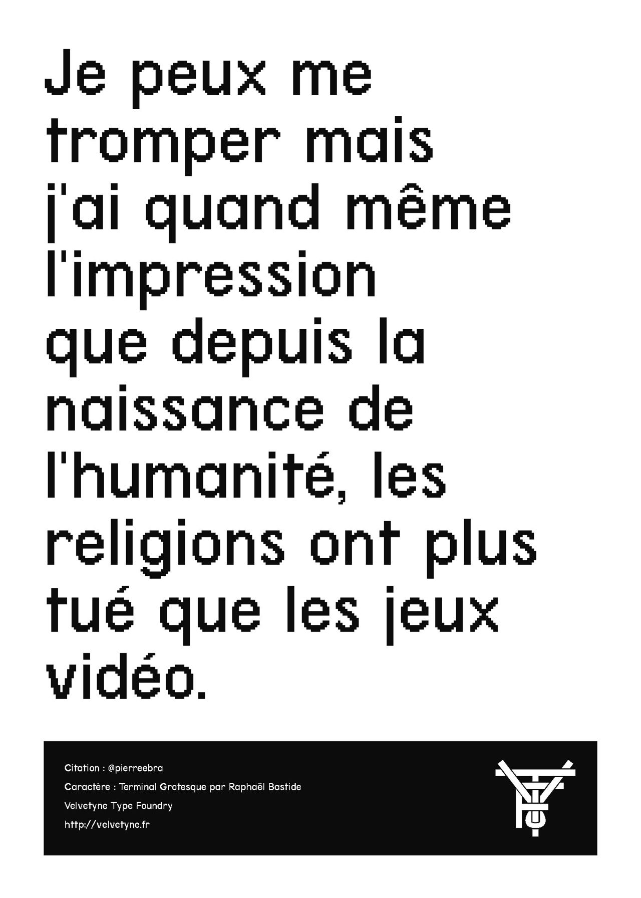
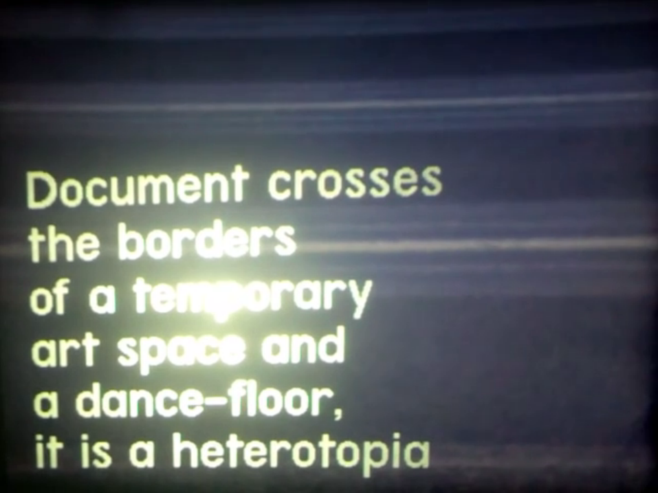
Terminal Grotesque in use