We design libre / open source fonts. Learn more and contribute to the adventure of Velvetyne by reading our “about” page.
Eric Mourier In Memoriam
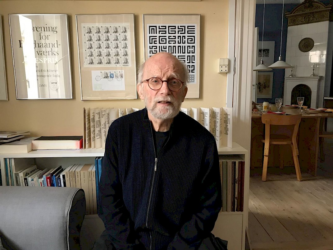
Eric Mourier, the Danish designer and author of the eponymous typography, recently died of pneumonia. At 82, the designer appeared as an elegant person, open-minded and curious.

Eric Mourier, Danish graphic designer, b. 1939, who was trained as a lithographer in 1961 at Den Grafiske Højskole (from 2008, The Danish School of Media and Journalism), specializing in graphic design. He then taught at the school between 1966 and 1981, and set up his own design studio with his wife Mette Mourier. Together the pair produced some of the best Danish book designs. They work in a traditional, typographic style with much attention to every detail. They have worked on almost every kind of design assignment, from post stamps to comprehensive, illustrated books. They are the authors of several educational books about book design from traditional offset printing and typesetting to layout and design on a screen. Their book “Book design. Layout and design of illustrated books” was updated and reprinted in 2013 and remains one of the most thorough and pedagogical Danish books about book design.
The revival of the Mourier typeface is a human journey. Sébastien Hayez, one of our first type designers, is also a book collector. In the pages of New Alphabets A to Z, published by Herbert Spencer (also publisher of the magazine Typographica), appears one of the first uses of Mourier. No explanation are printed but the whole casting of this book is a dream team of experimental modernism type design: Tom Carnase, Bob Gill, Wim Crouwel, William Sandberg, Derek Birdsall, Armin Hoffman, Ivan Chermayeff & Tomas Geismar, Wolff Olins, and Alan Fletcher. The Mourier Typeface seems to appear as the most radical type design of the book; its geometry shows a methodical construction and a preference for rational solutions (learn more about the type process here).
Creating the Mourier type was a personal project which took a new dimension when the designer asked Danish writer Knud Holten to write a poem “The Myth about the bird B” in 1970 (learn more about this aspect here). The booklet, bound as a leporello, became the only use of the type: type specimen, piece of experimental literature, a design utopia.
If the design revival was an easy task, finding the contact of his creator was something else. Thanks to the help of Frank Adebiaye, we found the contact of a Danish book publisher, working closely with Eric Mourier, who shared his e-mail.
While designing the original booklet, Eric Mourier explained “The letters have been transferred to film, cut apart, and mounted separately on self-adhesive foil, page by page.”.
In an e-mail addressed in 2011, his enthusiasm was vivid:
“It was wonderful and exciting to have the opportunity to set text with my own font! I am very satisfied with the outcome. It is absolutely perfect.”
Beyonce used the type on some of her merchandising in September 2020. Mourier reaction was precious:
“It was really a big surprise. Think that you should experience that your alphabet should appear in such a context. It’s really amusing, and of course it has attracted attention in the family and among colleagues.”
The Velvetyne team hope Eric Mourier’s memory will be still alive thanks to his work.
Our thoughts are with his wife Mette, his family, his relatives and all those who had the chance to cross his path.