VG5000
We are living in the future of the past
We are living in the past of the future
Aa Bb Cc Dd Ee Ff Gg Hh Ii Jj Kk Ll Mm Nn Oo Pp Qq Rr Ss Tt Uu Vv Ww Xx Yy Zz
Sie ist ein Model und sie sieht gut aus, Ich nähm sie heut gerne mit zu mir nach Haus, Sie wirkt so kühl, an sie kommt niemand ran, Doch vor der Kamera da zeigt sie was sie kann. (Kraftwerk - Das Model)
Download Fonts and sources

Font description

——————— English ———————

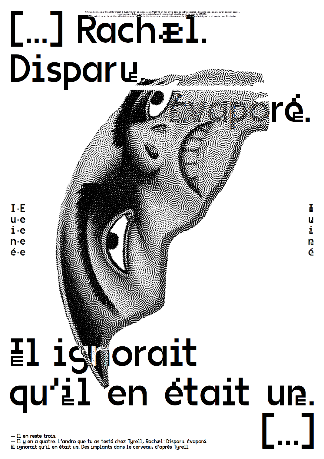
The VG5000 takes its name from the homonymous computer manufactured by Phillips, released in 1984. Its video processor displays bitmap characters built in a common matrix of 8x10 dots. The modern VG5000 is built on a grid 4 times more detailed, allowing more freedom and imagination of curves, where there were only right angles. The superposition of the new drawing onto the starting matrix sometimes reveals unexpected mixtures. Some right angles have been deliberately preserved as vestiges of the first digital fonts, offering a hybrid final shape. One of the inherited features is the accents that are always placed at the same height, forcing some letters to crash. Many glyphs and pictograms complete the VG5000's original set, including references to VG5000 games and the history of emoji.

Inclusive characters

The VG5000 character set contains a sample of experimental glyphs devoted to French inclusive writing, which involves linking the female and male genders in the writing field. These glyphs were imagined on the occasion of the project "On aime pas ça parce qu’on devient deux" initiated by Roxanne Maillet, artist having as a commitment research on the graphic representation of genders in writing: if it is not « il » or « elle » who speaks, it is « iel ». These new characters are built on the same grid as the originals, but they are smaller and combine together in one character.

Examples : ·e : étudiant·e | é·e : né·e | f/ve : veuf·ve | n·e : un·e | s·e : permis·e | u·e : vu·e | ie : iel

——————— Français ———————

Le VG5000 tire son nom de l'ordinateur homonyme fabriqué par Phillips, sorti en 1984. Son processeur vidéo affichait des caractères bitmap construits dans une matrice commune de 8 points sur 10. Le VG5000 moderne est construit sur une grille 4 fois plus détaillée, permettant ainsi plus de libertés et l'imagination de courbes, là où il n’y avait que des angles droits. La superposition du nouveau dessin à la matrice de départ révèle parfois des mélanges inattendus. Certains angles droits ont donc été volontairement conservés, comme vestiges des premières fontes numériques, offrant une forme finale hybride. L'une des particularités héritées concerne les accents qui sont toujours placés à la même hauteur, forçant certaines lettres à s’écraser. De nombreux glyphes et pictogrammes viennent enrichir le set original du VG5000 parmi lesquels on trouve des références aux jeux du VG5000 et à l'histoire de l'emoji.

Caractères inclusifs

Le set de caractères du VG5000 contient un échantillon de glyphes expérimentaux consacrés à l’écriture inclusive, qui consiste à lier les genres féminin et masculin à l’écrit. Ces glyphes ont été imaginés à l’occasion du projet « On aime pas ça parce qu’on devient deux » initié par l’artiste Roxanne Maillet, ayant comme engagement la recherche sur la représentation des genres à l’écrit : si ce n’est pas il, ni elle qui parle, c’est iel. Ces nouveaux caractères sont construits sur la même grille que les originaux, ils sont néanmoins plus petits et forment un seul caractère une fois combinés.

Exemples : ·e : étudiant·e | é·e : né·e | f/ve : veuf·ve | n·e : un·e | s·e : permis·e | u·e : vu·e | ie : iel

Character Set

/site/assets/files/1624/vg5000-regular_web.woff
Share this font on TwitterShare this font on Facebook